
The living room is the heart of our home, a place where we relax, socialize with loved ones, and welcome guests. The color of the walls plays a key role here, setting the tone for the entire interior and influencing our mood. The right shade can visually transform a space, making a room brighter, cozier, or more spacious.
Choosing a color often leads to a dead end, because you want it to be not only beautiful, but also harmonious. The answer lies not in one successful shade, but in their combination. The ability to combine colors is the key to creating an interior that will look cohesive, stylish, and reflect your personality.
In this article, we will look at how to choose a base color for the living room walls and what other colors it is best to combine it with. We will analyze both classic and more daring combinations, as well as give practical tips to help you avoid common mistakes. Look at inspiring photos and create a space where you will feel truly comfortable.
- Basic rules for combining colors in interior design
- The psychology, meaning, and perception of color
- Classic combinations
- Warm and cool colors in the interior
- Using gradients in interior design
- Tables of harmonious color combinations in interior design
- Popular colors for living room walls
- White
- Beige
- Brown
- Gray
- Green
- Yellow
- Blue and light blue
- Red
- Orange
- Purple and lilac
- Black
- Zoning the living room with color
Basic rules for combining colors in interior design
When choosing a color for interior design, you should be guided not only by your personal preferences, but also by existing rules of color combination. Incorrect combination of even two tones will cause dissonance in the interior and psychological discomfort.
What is the right color combination for an interior?
-
Use a range of shades within the same color. For example, combine light yellow, yellow, and dark yellow. At the same time, the palette should be diluted with a neutral companion that will help create a smooth transition from one tone to another. These are gray, white, and beige.
-
Use harmonious shades. There are universal colors—white, black, gray, and beige—that go well with any other colors. They can be used as a basis, diluted with contrasts.
-
Contrasting color combinations in the interior. To understand which colors go well together, use a color wheel—a palette of color combinations for interiors. For example, yellow and purple, orange and blue, and green and red harmonize well with each other. But you should not use them in equal proportions; one shade should be more dominant than the other.
-
Use adjacent colors (analogous triad). On the color wheel, these are green with blue and blue, orange with red and purple.

In addition, it is worth following the recommendations regarding the color scheme of the interior:
-
Don't use more than three or four shades. Choose a main color, and the rest will be its companions. The combination of colors in the interior is considered correct if the proportions are observed: 75% — main tone, 25% — companions, 5% — bright color accents.
-
It is worth using neutral shades for the background.
-
A monochrome interior can seem boring. To liven it up, it is worth adding bright decor and elements with different textures.

The psychology, meaning, and perception of color
When choosing a harmonious color scheme for your interior, you may recall the Luscher psychological test. It helps determine a person's state of mind based on their choice of colors. The test does not distinguish between gray, beige, white, or black—these are considered neutral colors. Instead, it highlights four basic shades: red, yellow, green, and blue.
Here's how to interpret them:
-
Yellow is a symbol of joy, happiness, new opportunities, and self-development. An interesting color combination in the interior (photo below): muted yellow, gray, and the green of living plants.
-
Red symbolizes self-respect, confidence, and power. Many people cannot get along with this color, considering it aggressive. But you can always add muted shades of red to the design of the room, such as terracotta or dusty pink.
-
Blue — self-restraint according to Luscher. In terms of its effect on the psyche, blue can be described as calming, peaceful, and conducive to good sleep.
-
Green — trust, optimism, confidence in one's own abilities. This color in the interior gives calmness, relaxation, and reduces fatigue.
Classic combinations
Some color combinations in interior design have become classics:
-
Black and white. The combination of two universal shades is suitable for any style and room.
-
Gray and blue. This color combination in the interior brings peace and tranquility. This refined, stylish combination is suitable for a bedroom, study, or library.
-
Beige (brown) with pink. A symbiosis of simplicity and classic style. The dusty rose shade is particularly relevant today.
-
Yellow — ivory. A bright combination, suitable for rooms that need additional lighting. The shades add a touch of joy, freshness, and purity.
-
Red and gold. Bright shades can look too pompous, but muted ones help to create an elegant, expensive interior.
Warm and cool colors in the interior
Combining colors in an interior with a cold and warm color scheme requires following certain rules:
-
Choosing a dominant color scheme—warm or cool—and adding accents of the opposite color helps to achieve harmony.
-
Applying the principle of balancing one tone with another. Thus, the result of this principle was the combination of turquoise and beige.
-
Use mutual reinforcement, when shades make each other deeper and more noble (for example, emerald and marsala).
-
Using the effect of muting, reducing saturation. An example of this technique is a neutral background with accent bright colors.

By combining a warm palette with a cold one, you can adjust the space. It is known that warm tones visually reduce the space, while cold ones make it deeper and wider.
Using gradients in interior design
Gradient (ombre) is a complex technique of combining shades from lighter to darker. It is used when painting surfaces, combining wallpaper, and selecting accessories. When decorating walls with a gradient, the transition is made from dark to light from bottom to top, thereby visually increasing the height of the ceiling.
When creating a gradient, it is important to find the right combination of colors in the interior. Then the ombre technique will make the room stylish, not just colorful. When combining colors, you can use a color wheel. The most common gradient is blue and gray.
The technique of painting walls with a gradient is often difficult for the average person, so you can simplify the task by using ready-made textiles or decor with ombre coloring (curtains, blankets, carpets, photos, floor lamps). Gradient curtains look especially good against the backdrop of neutral, solid-color walls. Small ombre rugs create an effect of volume.
Tables of harmonious color combinations in interior design
When creating a stylish look for your home, it can be difficult to figure out which colors are best to choose. That's why there are ways to simplify this choice. They were created by experts. In addition to the color wheel, these include a tabular form for selecting shades.
To choose the right color combination for your interior, the table offers ready-made options. All you have to do is choose the main shade, then see which complementary colors suit it. The tables, built on this principle, present several tones (five or six). The first is the main one, the next two complement it, and the fourth and subsequent ones are contrasting. With the help of such a palette, you can choose all the necessary shades for decorating a room.

Other tables may work differently. For example, after selecting a shade you like, you can see how well it matches with others. If the compatibility is low, it is worth looking for other options. Tables that show a shade and a range of matching tones offer more possibilities: similar shades, similar shades of other colors, or contrasting shades.
Popular colors for living room walls
The color scheme of the living room can be varied. The entire palette of existing shades is divided into warm and cool tones, which should not be mixed together. What colors can be used as a basis in any living room?

White
An undisputed favorite of classic style, it is versatile and perfect for creating a cozy room. Light colors create the effect of expanded space, visually increasing the volume of the living room. White easily combines with any other shade, especially black and white, a classic combination that will never go out of style.

Recommendations from Nadezhda Kuzina
The only rule for a “white” living room is to use bright and contrasting elements, because an exclusively white interior will create an impression of incompleteness. Such elements can include furniture, paintings or patterns on the walls, and curtains.
In general, the white shade of the walls can be compared to a canvas: the final picture will depend on your imagination.
Beige
This is another win-win option that makes it very difficult to ruin the design of the living room. This color scheme makes the room bright and spacious, is not tiring, and combines well with other shades.
Walls decorated in beige tones go well with natural wood furniture. This approach to room design will not leave your guests indifferent.

Design: Svetlana Startseva
Brown
There are tons of shades of brown, and they'll all add a touch of practicality and richness to your living room. Brown walls are great for rooms that get lots of light.
Just don't overdo it with brown, because excessive use of this color will make the living room look smaller. And one more tip: first paint the walls brown, and then choose furniture and other accessories in a different shade so that the elements of the room do not blend together.

Gray
Another versatile option for decorating living room walls. Any bright accessories, whether furniture or paintings, look good against a gray background. A good option would be to break up the monotony of gray with patterns or stripes.

Green
Among the many shades of green, there are both bright and dark options for decorating a living room. The presence of green will give the room a feeling of calm, which is so lacking after a hard day's work.
Green colors look original and attractive, but it will not be so easy to match them with other design elements. Shades of green may not go well with all furniture or flooring options, which makes it somewhat difficult to decorate a living room.
At the same time, the right combination of all factors makes a room in green tones cozy, beautiful, and mysterious. Natural colors are always pleasing to the human eye, which your guests will surely appreciate.

Yellow
A truly bright color solution for the living room. The use of yellow shades will be a lifesaver for rooms with insufficient natural light.
Bright yellow must be diluted with other, more subdued tones (white, gray, beige). The right combination will make the living room so cheerful and lively that you won't want to leave it.
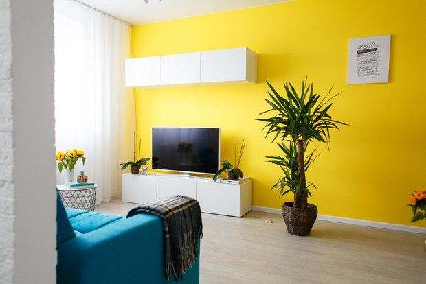
Design: Irina Sobylianskaya
Blue and light blue
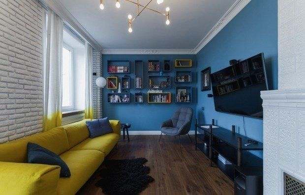
Blue and light blue colors are suitable for small rooms. These shades combine well with white, gray, yellow, lilac, and brown. Do you want to make your living room a place of peace and tranquility? Then blue tones will be a good solution when choosing a color scheme.
When using blue or light blue, it is important to know when to stop and be able to combine it with the material of the furniture and other elements of the living room. With the right combination, the room will look refined and unusual.
Red
The use of red, when done correctly, can lead to good results. However, an excess of this color can make a room overly saturated and contrasting, which can be harsh on the eyes and may shock guests.
Want to use red tones? Dilute them with white furniture and curtains. This will reduce the “danger” of red in the room and relieve eye strain.
Orange
This is where you can really tell a lot about someone's personality if they use orange to decorate their living room. Walls painted this color will obviously show the owner's positive attitude and put guests in a good mood.
Overdoing orange is the same mistake as with red. Since orange is very popular with designers, they advise diluting it with white, gray, beige, or black.
The color of the walls in the living room sets the mood for the entire space, and it should be chosen based on the size of the room, lighting, and the desired atmosphere. Light shades—beige, gray, milky—visually expand the space and go well with bright accents. Dark or saturated colors—deep blue, emerald, chocolate—create coziness and nobility, but require good lighting. It is important that the color of the walls harmonizes with the furniture, curtains, and floor—pastel combinations or contrasting pairs work best, where one color is the main one and the second emphasizes it. Photos of interiors help you see how different shades look in real life.
Purple and lilac
Purple is a symbol of wealth. The decision to paint the living room walls in such shades speaks to the creative and extraordinary thinking of the owner. A rich style and unusual design are what you can achieve when choosing lilac and purple colors for your living room decor.

Black
Here we can once again mention the classic combination of “white + black,” which is sure to impress you and your guests. However, the use of black for wall decoration is quite controversial, although acceptable in the modern world of design.
It is believed that black shades can cause sadness and melancholy in those who are in the room. However, there are now many designs where black tones fit perfectly into the overall picture of the living room. The main feature is the use of additional matte, metallic, and chrome shades of the color palette in the room's furnishings.

Design: Kameleono studio, Pavel Lichik and Anastasia Ivanova
Zoning the living room with color
Zoning is an excellent addition to the overall design of the living room. In particular, the room should have a relaxation area where guests can sit on the sofa and spend their free time enjoying pleasant conversations. How can you divide the space?
- An excellent solution would be to paint one of the walls in a bright, saturated color. This contrast is especially noticeable in a room where the main shades are beige, gray, white, and other light colors. The brightness of the object will visually divide the room into several zones.
- If you have a dark room with walls and other features in shades of brown, dark green, and blue, you can highlight the leisure area by installing floor lamps, lamps, and light fixtures.
- If you add a few paintings or photographs to plain painted walls, you can also highlight a corner in the living room.

As you can see, choosing a color for your living room walls is not just a matter of “like or dislike.” It is your main tool for creating the right atmosphere. It sets the tone for the entire space and affects the mood and perception of the room.
Don't be afraid to experiment with combinations, but remember to maintain balance. The safest approach is to choose one dominant shade and add one or two accent colors. If in doubt, use a neutral base and add brightness through details: textiles, paintings, decor.
Ultimately, the best color is the one that makes you feel comfortable and happy. Let your living room reflect your personality and become a place you always want to return to. Trust your taste, and you will succeed.


