
Beige is often considered a boring or overly safe choice. But this is a big misconception. In fact, it is not just one color, but a whole palette of warm, soothing shades — from light sand to rich caramel. Its main strength lies in its ability to be the perfect backdrop, which does not tire the eyes and creates a feeling of comfort and spaciousness at the same time.
The secret to a stylish interior with beige lies not in the color itself, but in the right combinations. On its own, it can look flat. But add other tones to it, and the room immediately comes to life, acquiring character and depth. It's like adding spices to a neutral dish — it's the accents that reveal the full flavor.
Combining beige with other colors is not as difficult as it seems. There are simple and proven rules that will help you avoid boredom and create a harmonious space. You can go for a calm contrast by adding dark or cool shades, or, conversely, enhance warmth and comfort by turning to a related palette. Let's figure out how to do this.
Why is beige so popular?
The popularity of beige, which is growing every year, can be explained by the following factors:
- a wide selection of colors, numbering more than 1,000 shades.
- it can be combined with most other colors, both warm and cool.
- it is versatile for any type of room in a house or apartment.
- it is both the main color of a noble design and a neutral base for bright accents.
- it can visually expand the room, making it more spacious. A combination of two shades in the form of vertical or horizontal stripes on the walls is especially relevant for solving this issue.

Beige is both multifaceted and versatile. It does not attract attention, but at the same time visually neutralizes the effect of high air temperatures in the room, helps to calm the nervous system, promotes relaxation, and creates a good atmosphere in the home and a positive mood for its inhabitants.
Even when used as the main tone in a room, beige will not dominate. Beige does not create contrast, but only emphasizes the depth of the shade or mutes it.
Beige is not boring, but rather a beneficial foundation for an interior, giving a feeling of comfort and making the space brighter and more spacious. The main thing is not to be afraid to combine it with other colors: with gray, it creates restrained elegance; with white, freshness; with green and blue, natural harmony; and bright accents such as terracotta or mustard add warmth and character. The main rule is to play with textures and shades so that beige does not become a background but a lively, warm foundation for a stylish and comfortable home.
What colors go well with beige?
An interior decorated in beige tones has a certain magic of elegance and luxury, but to achieve this magic, you need to be well aware of certain rules for combining it with other colors and materials.
When working on interior design, the question often arises of what beige goes well with—it goes well with almost all bright colors (purple, bright pink, blue, red, black, etc.). Beige goes well with natural tones such as white, green, pink, brown, and terracotta.

Beige in an interior can emphasize the features of a room. Stairs, tapestries, panels, moldings, and balusters look weightless and elegant when combined with beige tones.

The cream version of beige looks great with white, red, blue, and black, emphasizing depth and luxury. Combinations of yellow and white in the interior are perfectly complemented by gray-beige, while orange and turquoise accessories fit well with shades of beige.

In addition, different variations of beige complement each other wonderfully—a light shade on the walls can be complemented by a brown floor or a sea sand-colored ceiling.

Beige shades combined with gray and gold look rich and expensive. Natural wood can perfectly complement the interior. Thus, all matching shades can be easily incorporated into the interior of a room to emphasize the versatility of beige.

It is worth considering possible color combinations for different interiors:
1. The combination of beige and brown is like the union of two close relatives. Complementing plain walls with brown accessories makes the space brighter and visually expands it. If you need to add contrast, choose darker shades of brown.

2. A mixture with gray in the interior is called “greige,” and it can cool the atmosphere. Usually, such combinations, so that they do not look boring, faceless, and neutral, are diluted with small bright accents in the form of yellow, turquoise, and coral. These two colors seem to dissolve into each other.

3. The beige and blue tandem is similar to the previous combination of warm and cool shades. But it does not need additional bright accents. Blue itself is not only a balancing but also a bright addition, which can be used in carpets, sofa cushions, curtains, bedspreads, armchairs, throws, headboards, and more.
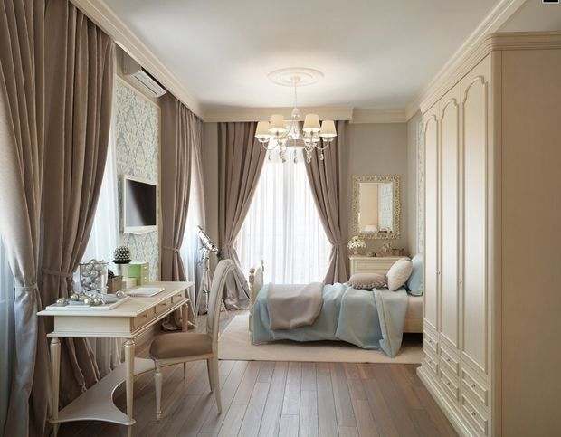
4. An interior in beige and purple tones looks very attractive. Beige slightly dampens the brightness of purple, but also gives it a slight “powdery” effect. Beige can be combined with purple in different ways: evenly, i.e., the interior is filled with two colors in equal measure, or beige can be the dominant color. Purple can be used for details, such as prints on textiles, upholstery, curtains, furniture, and accessories.
5. Combining it with pink allows you to make the room cute without oversaturating it with cloying sweetness. Beige goes well with both aggressive pink accents and delicate tones that relieve tension, remove aggression, and allow you to relax.
6. Combining beige with yellow in interior design will create a sunny, warm, bright room. In this combination, yellow will not overheat the room; it is better to use it only as accents and details.

Nails;

An excellent option is a screen, which divides the room into zones. It is not very difficult to make it yourself. You will need:
In most cases, many combinations of beige with other colors are complemented by white elements. They help to make the space wider and add more light.
Beige in different interior styles
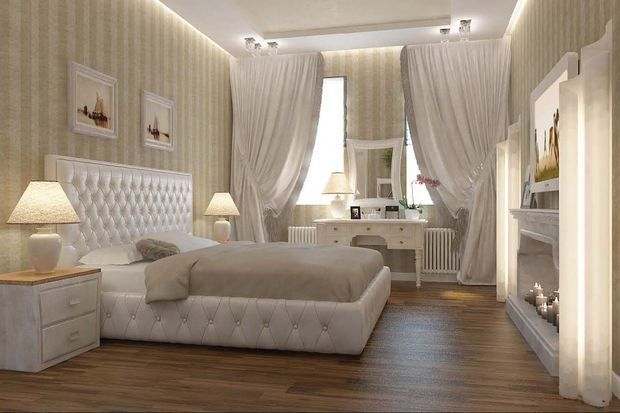
A beige interior is most often the embodiment of classic style. Light brown shades are usually chosen in combination with white, gold, brown, yellow, and gray details in textiles, furniture upholstery, and accessories in a classic-style room.
Hammer;
- they will look harmonious in rooms decorated in historical styles from antiquity to modernism.
- thanks to the naturalness of the shades, it fits perfectly into eco, Scandinavian, and minimalist styles.
- cool tones can soften the atmosphere of high-tech or steampunk styles.
- styles such as country, Mediterranean, Arabic, Egyptian, and Russian retro are impossible to imagine without warm and sandy shades.
If desired, beige can be used in a suitable and appropriate style, if not as the main color, then in accessories and decor.

Screen
This option will work equally well in the kitchen and in the nursery. The main thing is to find the right combination of beige in the interior.
What colors go well with beige and where it will look best in an interior:
Fabric.
Shelving units for dividing a room into zones look good in a modern interior. Open shelves, on which you can place various souvenirs and necessary items, create a feeling of lightness and do not clutter the space. For small rooms, this is a real find. By making the bottom closed, certain items can be stored there, replacing a wardrobe and saving space. Slats;

3. The color combination will be more harmonious and light if you add a large amount of textiles, such as silk curtains, linen furniture covers, cashmere or wool blankets, and velvet sofa cushions — this will create a layered effect in the interior.
Furniture

A shelving unit for zoning a room does not have to be tall, reaching the ceiling. A lower one separates the zones while still leaving a feeling of space. If the room has only one window, the area can be separated with a translucent shelving unit equipped with lighting. This type of partition is versatile, made of metal or wood, bamboo, rattan, or rice paper, and suits any style of room. It is affordable and easy to maintain and assemble. By arranging the furniture in a certain way, the room can be perceived differently. Placing a sofa and a table to the side of the entrance or opposite the fireplace or TV creates a cozy atmosphere for relaxation. The room can be divided into zones using consoles, bar counters, and chests of drawers. A sofa and a table placed behind it are a good way to separate areas for relaxation and work. This option is convenient and does not require any financial investment, and the rearrangement can be done at any time.
Corners;
Beige in different rooms
To make your living room look stylish, you can use advice from professionals to find out which colors go well with beige.

For the living room walls, it is better to choose 1 or a maximum of 2 shades of beige. For an energetic living room, a cream shade complemented by orange is suitable, while for a strict living room, a combination with blueberry or burgundy is suitable. Recently, it has become popular to add turquoise to beige tones in the living room.

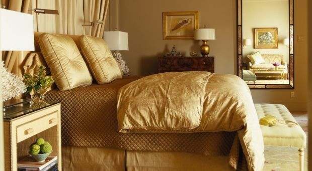
It is best to choose colorful accessories for the living room in beige tones, with unusual textures and shapes. Beige in the bedroom—designers recommend using this shade in the bedroom either for walls, ceilings, or floors, or as a decorative element.

If you choose to decorate the walls in beige tones, the bed and bedding should be contrasting. If you decorate the bed, windows, or furniture in the bedroom in beige tones, consider blue for the walls and dark wood for the floor.

Beige in the kitchen – Currently, beige is the most popular color for kitchen interiors, as it can create a clean, stylish, and cozy space. By combining beige with black or white, you can create a modern kitchen interior that does not require daily cleaning. In this case, experts advise adding black shades to the color scheme of the refrigerator, stove top, and kitchen work surfaces, which will reduce the need for cleaning.

Kitchens that combine red tones are also interesting and suitable for owners with extravagant tastes. Light brown colors in the kitchen can be easily combined with various bright shades—green, yellow—but only if they are present as separate decorative elements.

Children's room – there is a common myth that beige is not suitable for a child's room, as it is a very dirty color combination, etc., but many child psychologists consider it an ideal aid in raising children.

This color occurs in nature, it calms and sets the child up for rest or homework, it does not distract attention, awakens self-confidence, and balances the child's emotional state.

Beige is suitable for children of both sexes, it's all about the color combination. For girls, these are their favorite pink or red shades, while for boys, emerald, turquoise, or chocolate shades are well suited.
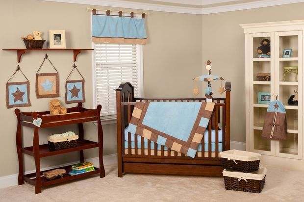
As in other rooms in the apartment, beige can be combined with other shades on the walls or in interior details in the nursery. The most popular combination among parents is bright accents in the nursery, such as a bright pouf and dressing table for a young fashionista, or shades of blue in the window design or boys' workspace.

Advantages and disadvantages of beige
Advantages of the color:
- it has a variety of shades (cream, pink, brown, gray, etc.); · it goes well with almost all existing tones and semitones;
- can be a good backdrop for bright accents;
- visually expands the space, etc.

This shade has no significant drawbacks, except that it should be used with caution if there are animals in the house. Therefore, beige is a good decorative element, offers many opportunities to play with the interior, and can be used in different style solutions.

As you can see, beige is not a boring background, but a full-fledged tool for creating an interior. Its main strength lies in its versatility and ability to emphasize other colors, making them deeper and more expressive.
Don't be afraid to experiment with combinations. Start with a neutral base and then add accents that you like. Remember that textures are your best ally when working with beige; they will prevent the space from becoming flat.
The result is an interior with a beige color that is cozy, calm, and very lively. It does not dictate rules, but creates a harmonious foundation for your life, where you will feel comfortable every day.


