
Have you ever noticed that you want to linger in some rooms of your home, but leave others as quickly as possible? Often this feeling is associated not only with the surroundings, but also with the colors that surround us. The ancient science of Vastu, like feng shui, asserts that color is a powerful energy tool that can influence the atmosphere in the home and our well-being.
According to Vastu, each sector of the home is associated with a specific element and sphere of life. By selecting a color palette in accordance with these principles, we can maintain harmony in the space. These are not strict rules, but wise guidelines that help create a home that is good for both the body and soul.
Let's go through the eight main areas and figure out which colors can enhance the energy in the areas of love, work, leisure, or creativity. These tips are a great starting point for filling your home with colors that will bring peace, joy, and balance.
Color in interior design is more than just color
Colour does more than just create the atmosphere in a home. The energetic vibration of each shade is perceived by a person on a subconscious level and affects their well-being, evoking emotions, memories and associations. That is why it is important to surround yourself with colors that care for your physical, mental, psychological, and energetic health.

Vastu tips for color in interior design
Choosing colors for the interior is always a “torture of choice.” But with Vastu, there will be no complications or doubts: you will receive a clear and understandable “road map” — which color is best to use where and why.
These rules are the same for all rooms in the house: kitchen, hallway, bedroom, study, and others. In any house or apartment, there are eight zones (according to the cardinal directions), and each zone is influenced by its own element: Water, Earth, Air, Fire, Ether.

For example, if the kitchen is located in the Water zone, choose a color palette that corresponds to this element — not only will you avoid the “agony of choice,” but the right color will also harmonize the atmosphere in your home.
Vastu recommends using calm, natural, unobtrusive, and non-irritating colors in living spaces. Bright, explosive, contrasting shades are only suitable for commercial premises and business spaces: restaurants, hotels, shops.
Water Zones: North, Northeast
The color scheme in these areas should resemble a foggy morning on the seashore. Use light pastel cool colors, as well as shades with a slight sheen (pearlescent) — light blue, milky, white, silver, delicate mint, “dusty” blue.
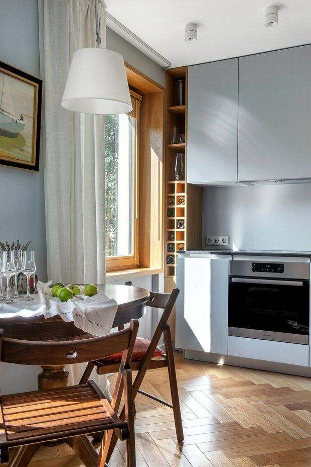
Design: Natalia Lenda, LENDA DESIGN
This color palette in the north and northeast will harmonize not only the aura of your home, but also your inner state.
Earth zones: south, southwest
In Earth element zones, the best choices are sand, wood, muted yellow, brown, gray, cinnamon, dark autumn tones, coffee, and dark chocolate. All shades should be warm to absorb and neutralize negative energies that enter the house from the south.

Do not overuse black in interior design: it is the “evil” expression of the Earth element. Black is only acceptable in decorative elements and interior details. Do not paint a wall black in your home, let alone the ceiling — otherwise, the energy of sadness and achieving goals through overcoming obstacles will “turn on” in the space.

Air Zones: west, northwest
In blue and light blue should predominate in the Air element zones. Blue in the western zone controls the mobility of Air, preventing it from turning into a “hurricane,” and as a result, instead of chaos and haste, orderliness in thoughts and actions comes into the lives of the inhabitants. In addition, the correct use of blue in the interior has a rejuvenating effect, protecting residents from “rapid maturation” (aging).

Blue is Saturn's favorite color (this planet rules the western zone of the house). When we bring the energy of blue to the west, Saturn is pleased, which means there will be fewer difficulties in life. After all, Saturn is a harsh planet that teaches us lessons through trials, and it is better not to “anger” it. The more harmonious the west side of the house is, the easier life will be.

Don't be afraid to use blue in your design: it goes well with different interior styles, from classic to ultra-modern. Choose a “dusty” blue for the walls or make the walls sandy, adding blue accents (curtains, blankets, pillows, vases) — both of these shades are natural, unobtrusive, calming, and complement each other perfectly.

Design: Natalia Shirokorad
The main thing is to remember that beige loves contrasts. Add dark or bright spots, play with the textures of wood, stone, metal, and fabrics. These details will prevent the room from becoming boring and faceless.

Cool, light “moonlight” shades with a slight sheen (white, milky, silver, pearl) are also suitable for this area, allowing your thoughts to calm down and flow like drops of cool rain.
Fire zones: southeast, east
The color of fire is red. But it should not be used in the southeast zone: Fire is intense here and has an explosive nature (like a volcano). Decorate the interior in “earthy” tones to neutralize the intensity of the Fire element in the space — complex yellow, sand, cappuccino, and nutty colors are suitable. If red is present in the southeast of your interior, you are guaranteed to have quarrels, conflicts, and irritation for no reason.

A beige living room is a classic design solution. For this reason, even someone who knows nothing about design and construction can work with beige shades. Using beige, it is simply impossible to ruin the interior of a room.

Design: Anastasia N.Interior
The color in your home affects not only your mood but also the energy of the space. According to Vastu teachings, each corner of the home is associated with a specific area of life, and the right color helps maintain balance. For example, it is better to paint the east in light shades to support health, the south in warm tones for confidence, and the northwest in calm colors to improve communication and relationships. The main thing is not to overload the space with flashy colors, but to choose shades that “breathe” and go well together. Simple solutions such as repainting one wall or changing curtains can significantly improve the atmosphere.
The Ether Zone: the center of the home
The central area of the house is called Bramastan — the place of the creator. This area connects us with spiritual divine energy, so the design of the interior here should be airy, light, and bright. Light blue, milky, white, and silver shades work well.

Design: Anastasia Krasnova
By applying the principles of Vastu to the colors in your home, you are not just decorating the space. You are working with energy, creating a favorable atmosphere around you that supports your goals and improves your well-being.
It is important to remember that these tips are not strict rules, but recommendations, a starting point. The key to success is a sense of harmony and comfort. If you categorically dislike the color prescribed for the zone, you can use it in accents: textiles, paintings, decorative elements.
Start with one room and listen to your feelings. Color is the easiest and fastest way to subtly but noticeably change the mood of a space. Gradually, you will be able to create a home that is not only beautiful but also filled with balance and tranquility, which is the main goal of Vastu.


