
Choosing colors for the living room can seem like a daunting task. We are afraid of making a mistake and ending up with a space that is too bright or, conversely, too dull. But in fact, there are proven principles that will help you create a harmonious and cozy interior, even if you are not a designer.
The main secret is to start by choosing one main color that you really like. It could be a calm shade for the walls or the color of a large sofa. Use this “anchor” as a starting point. Additional colors should not clash with the main color, but rather support it, creating the desired mood — from energetic to relaxing.
In this article, we will look at some simple rules for combining colors and show you some successful palettes. You will see how, with just two or three colors and neutral shades, you can transform your living room, making it stylish and comfortable to live in.
What combinations are there in the palette:
- Monochrome palette involves the use of different shades of one color, from lighter to more saturated. Creating an interesting monochrome interior is difficult, but possible—to do this, focus on different textures, fabrics, and finishing materials.

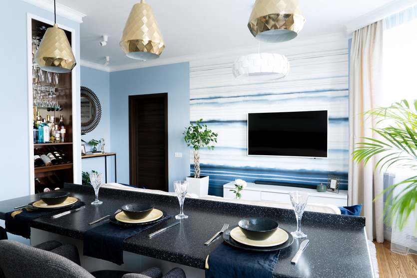
Project author: Svetlana Gavrilova
Project author: Svetlana Gavrilova
- Contrasting color combinations – use shades that are opposite each other on the color wheel: for example, purple and yellow, red and green. Here, you cannot do without complex tones, which will help create a more harmonious atmosphere than pure colors.


Project author: Tatiana Mironova
Project author: Tatyana Mironova
- Related harmony – colors that are next to each other on the circle, for example, blue, blue, and purple. One of them will be dominant, the other secondary, and the third accent.
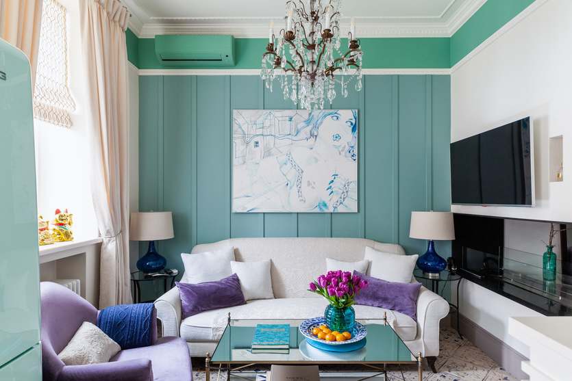
Project author: Natalia Vologdina-Anikina
Project author: Natalia Vologdina-Anikina
- Classic triad this involves using three colors that are equidistant from each other on the color wheel, for example, yellow, burgundy, and blue. Combining these colors in your living room interior will make the room more interesting, complex, and impressive.

Project author: Alisa Svistunova
Project author: Alisa Svistunova

Project author: Natalia Shirokorad
Project author: Natalia Shirokorad
The most effective color combinations in the living room interior + photos
Pink + beige
Pink tones look good in natural light and in evening interiors with the subdued light of lamps and candles. For large furniture, use rich shades of milk chocolate. Bold accessories in bright colors or, conversely, pastel shades are suitable for accents.

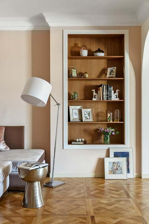
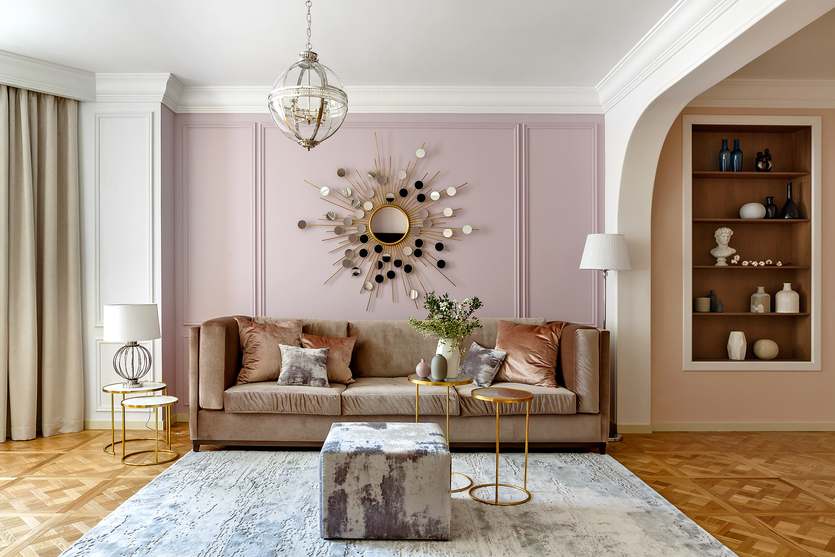
Project authors: Irina Kilina, Ekaterina Dudkina
Project authors: Irina Kilina, Ekaterina Dudkina
Blue + beige
Sky blue can be surrounded by light, unsaturated gray, beige, and warm neutral shades for an excellent combination. You can also use a combination of two colors of wallpaper in the living room: in the photo and in real life, blue and beige will look great together. Together, they create an atmosphere of serenity. The color of morning mist is suitable for matte and glossy furniture surfaces, and warm brown shades will add a touch of luxury to the room.


Project author: Evgenia Mishina
Project author: Evgenia Mishina
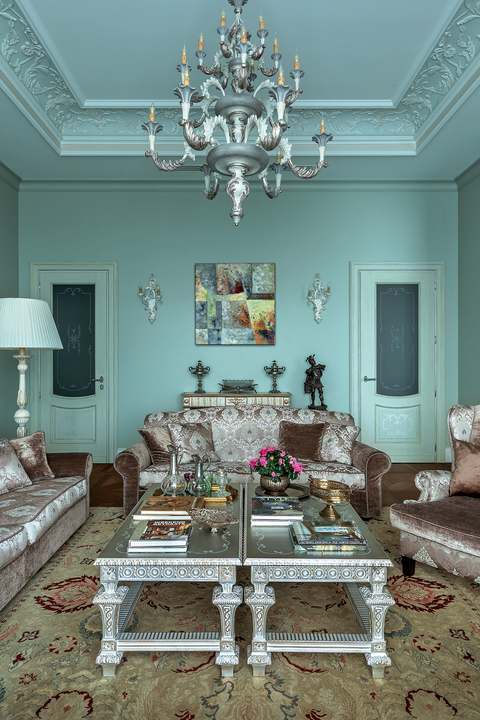

Project author: Ekaterina Rudnitskaya
Project author: Ekaterina Rudnitskaya

Project author: Ekaterina Tretyakova
Project author: Ekaterina Tretyakova
Green + beige
Muted green tones are well suited for creating a simple and relaxed atmosphere in the living room interior. If you have chosen rich shades of grass and greenery, focus on natural materials in the decor — warm wood, natural beige and brown stone, wooden furniture. You can complement the setting with peppermint colors in textiles — curtains, pillows, and bedspreads.
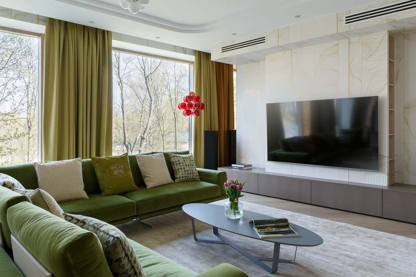


Project authors: Dmitry Mudrogelenko, Zlata Mudrogelenko
Project authors: Dmitry Mudrogelenko, Zlata Mudrogelenko
To make the living room interior look stylish and cozy, it is important to combine colors according to a simple principle: one main shade, one or two additional shades, and one accent shade. Start with a neutral background—beige, gray, or white—to make the room brighter and more spacious. Add depth with richer tones in furniture or curtains, and bright details—pillows, rugs, or paintings—to bring liveliness. Successful combinations: gray with yellow, beige with blue, white with wood tones — they are harmonious and not overwhelming. The main thing is not to overload the space, leaving room to “breathe.”
Gray + citrus shades
Gray walls in the living room are suitable for almost any color combination. An excellent combination would be light gray bon, concrete-colored walls, and rich citrus shades. It is important to consider what time of day the sun shines into the room—ideally, when yellow and orange shades are illuminated by the rays of the setting sun. However, in this case, it is better to use bright sunny shades sparingly, as accents.

Project author: Natalia Suslina
Project author: Natalia Suslina
Blue + yellow
Bright blue can be the main tone for interior design. And not only as the main color for the walls, but also as a shade for large furniture, such as a bookcase or a wall-to-wall cabinet. Rich citrus tones will complement a turquoise interior with contrasts. This color scheme is perfect for a modern interior.

Design: Enjoy Home
Design: Enjoy Home

Project author: Daria Maximova
Project author: Daria Maximova
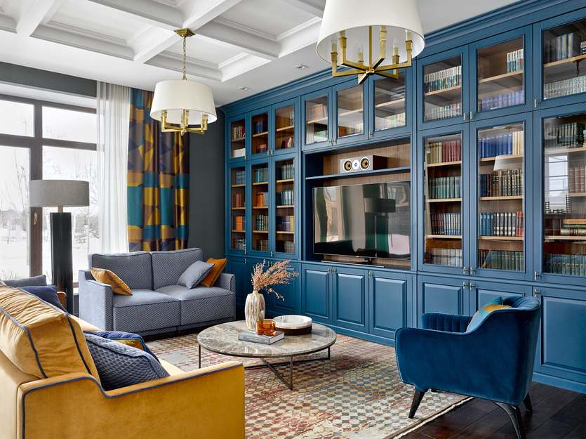
Project author: Ksenia Ivanova
Project author: Ksenia Ivanova

Project author: Rimma Semenova
Project author: Rimma Semenova
Light yellow and blue
A pale shade of yellow will add zest to an outdated interior and breathe new life into it. The combination of yellow and blue is a classic combination, but it never ceases to inspire designers. Shades of blue in the living room interior create a feeling of airiness and cleanliness. Shades of water and lemon go together perfectly.


Project author: Margarita Sivukhina
Project author: Margarita Sivukhina
Choosing a color scheme for the living room may seem like a daunting task, but it is actually an exciting creative process. The main thing is to start with a basic, neutral background and add accents to it gradually. Don't be afraid to experiment with shades, textures, and your emotions.
Remember that the most harmonious interiors are often built not on strict adherence to rules, but on a sense of proportion and personal comfort. If you like a certain combination, it inspires and relaxes you — that's your ideal choice.
Ultimately, your living room should reflect your personality and be a place you want to return to. Trust your taste, use color schemes as aids rather than dogma, and create a space where you and your loved ones will feel truly comfortable.


