
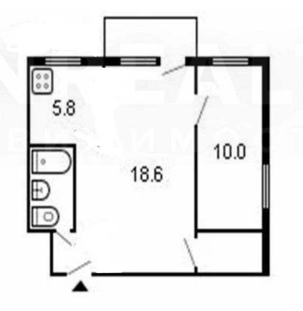
Imagine a typical Khrushchev-era apartment: cramped rooms, low ceilings, a small kitchen, and a feeling that there is never enough space. That is exactly what this 43-square-meter apartment looked like before the renovation—tired, with a layout that had long ceased to suit its owners.
But what if we look at these square meters not as a limitation, but as a blank canvas? The designers and owners of this apartment decided on a bold redesign. They literally tore down the old walls to create a modern and functional home that can hardly be called a standard “Khrushchev-era apartment” anymore.
In this article, you will see an amazing transformation. We will show you how a dark one-room apartment became a bright two-room apartment with space for both privacy and entertaining guests. The “before” and “after” photos are so contrasting that they are really hard to believe. Ready to be inspired?
About layout and budget
It was my first renovation ever, but thanks to the insight I gained during several months of quarantine, studying the pages of bloggers who shared their renovation experiences on Instagram, I knew exactly what I wanted.
I really like the layout of a classic two-room Khrushchev-era apartment, and it was ideal for combining the kitchen and living room areas. I didn't have a design plan, so I chose solutions based on examples I had saved from social media and finishing materials that were relevant, available, and within my budget. The reasonable limit for the renovation with furniture was one million rubles: (spoiler) and I stayed within it.
About the kitchen for 48,000 rubles
I chose a white kitchen with smooth matte fronts, hidden or integrated handles, and a natural oak (Wotan oak) countertop that extends onto the windowsill to increase the work surface. Because the kitchen is non-standard in size, my favorite solutions from IKEA did not suit me. The only option left was to have it custom-made.
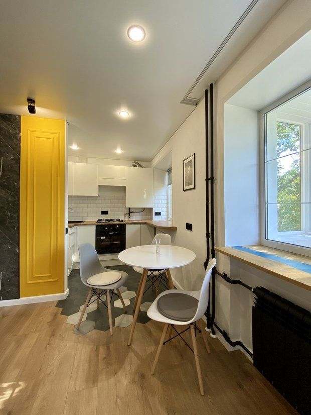
The kitchen furniture is a popular Eames-style alternative that many people are familiar with. It is light, beautiful, and practical.
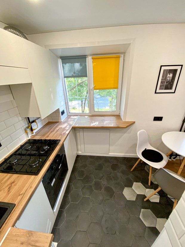
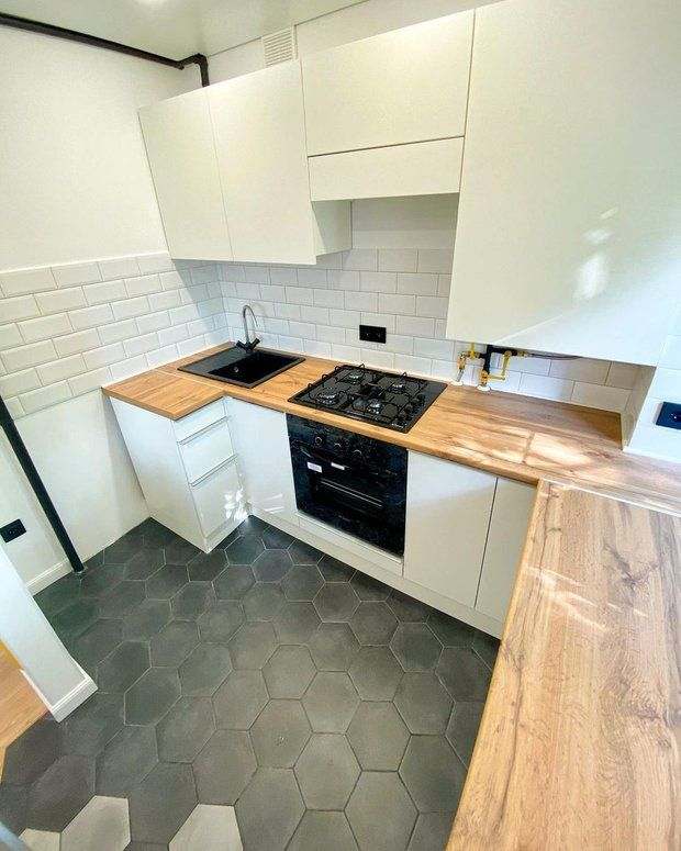
The floor is covered with graphite/gray Kerama Marazzi porcelain stoneware in the shape of hexagons.
The first contractors made me wait two months, then returned my prepayment and said that they had damaged the fronts during assembly, and that redoing them would mean waiting just as long again. This was a big fly in the ointment of the renovation, as the lack of a kitchen meant that all the deadlines for completing the renovation were missed.
I had to urgently find contractors who could quickly fulfill the order from scratch. I turned to a local company with production in Tula so I wouldn't have to wait as long. In the end, I was lucky to find the company “Gorod N,” which made my white baby in a month for an incredibly affordable price of 48,000 rubles (including installation, cutting, and delivery).
About laminate on the walls
The design of the room, and indeed almost the entire apartment, began with a laminate wall in the TV area. Black has never scared me in interior design — it's my favorite color. When I saw this laminate at Leroy Merlin, I knew right away that I would use it somewhere, and I found what I think is the perfect place for it. It looks like porcelain stoneware, but it's 8 mm laminate.
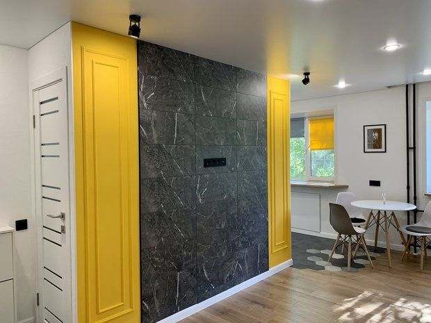
I asked the workers to leave two 50 cm columns to the left and right of the laminate wall and prepare them for painting. Then it was like a fog: I saw moldings on the walls in a coffee shop, watched installation videos on YouTube, went to the construction market, bought the right amount of duromer polymer, titanium glue, a small saw, and a miter box. And on my day off, while the workers were away, I drew frames on the wall, sawed the moldings at a 45-degree angle, and glued them on.


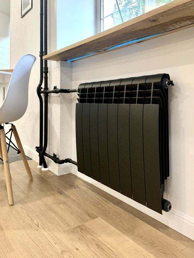
Behind the laminate wall under the granite, graphite hexagons asked for a continuation of the dark theme. It was not possible to sink the heating pipes into the walls, as the neighbors above/below did not want to change them with me. I decided to paint them in matte graphite.
A typical 43-square-meter Khrushchev-era apartment can be transformed into a cozy two-room apartment with a modern design and convenient layout—and one such apartment has become proof of this. The owners decided on a bold redesign, combining the space, getting rid of the cramped feel and old partitions, and using light colors, proper lighting, and smart furniture to transform the dwelling from the last century into a bright, functional apartment with space for both living and inspiration. The “before and after” photos are shocking — it's hard to believe that this is the same house.
About the bedroom
The granite-effect laminate collection also included a beige color, which I decided to use for the columns at the head of the bed. This was to avoid duplicating the laminate wall in the center, but to maintain this technique in the bedroom. Between the columns, I decided to order photo wallpaper in muted shades with a floral theme.
I ordered wallpaper from an offline store catalog in the exact size that matched the required opening. I ordered the lamp fixtures — black metal cubes — on AliExpress; they had an incredible number of positive reviews with photos. I was satisfied, and the electricians had no problems connecting them.
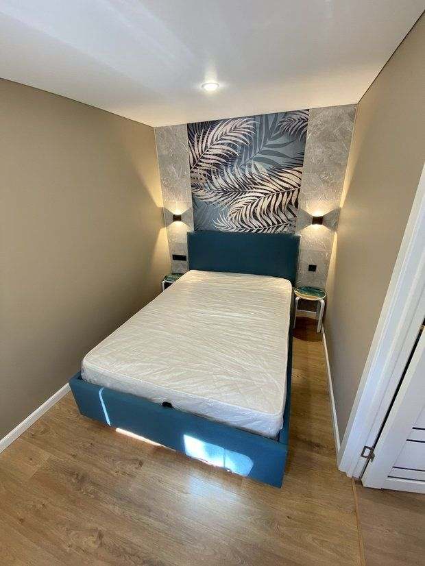
The bed with a lifting mechanism was purchased at Hoff for 18,000 rubles.
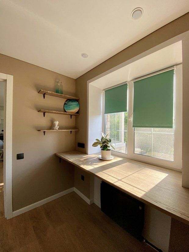
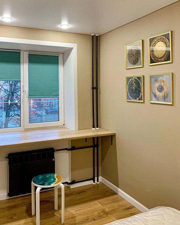
The area by the window in the bedroom was also immediately designated as a workspace. I am in love with wide window sills. In reality, it turned out to be difficult to find a custom-made 80-90 cm wide countertop from wall to wall. I considered solid wood and furniture board, and in the end I chose and ordered a 25 mm countertop from a kitchen manufacturer to fit the width of the room.
On site, the installer made cuts on the sides and installed steel corner brackets under the countertop to the walls. The pine shelves to the left of the window were ordered from a local loft workshop along with the window sill (with epoxy resin), which is installed at the balcony block.

About decorating walls with your own hands
I really wanted more white walls in such a bright but small apartment. It was decided to make the hallway white, as it is very small, as well as the wall continuing from it, the kitchen, and the wall with windows. Putting up white wallpaper seemed like a crazy idea to me, but I always liked textured white matte plaster.
The foreman calculated that, together with the materials, the work on 25 m² of wall space would cost about 30,000 rubles. I wasn't quite ready for that: of course, I liked the walls, but I understood that they were just a backdrop, unremarkable, simply convenient to use.
I turned to the internet and found videos on YouTube about textured paint, which does not require any special approach or skills on the part of the worker. I went to the construction market, having chosen Jobi PutzEffektFarbe textured paint in advance, and bought primer, rollers, a tray, a couple of spatulas, and a trowel. Two days off, five thousand rubles (all materials + 10 liters of paint) — and everything is ready.

Tip: the best is the enemy of the good! Some people recommend covering textured paint with a matte varnish for textured plaster so that it is easier to clean if it gets dirty. I decided, like a good student, to follow the advice. But after a month, the varnish began to take on a yellowish tint of varying degrees of saturation. I had to take matte white paint and repaint the walls to restore their whiteness! Don't make my mistakes: perhaps this varnish is really good if you have tinted textured paint in a rich dark color, but it can ruin light shades.
I also wanted to paint the walls where I planned to use color, but after calculating the cost of leveling, preparation, and painting, and having experience with solutions that are not always practical (it's easy to chip, scratch, or damage the paint, and if you paint over the “damage,” it is often visible), I decided to buy wallpaper that imitates painted walls, Inspire Pablo from the same Leroy Merlin. Gray for the living room, cappuccino for the bedroom, and blue for the dressing room. Plain, wide, with the texture of a painted wall, no fitting required — I'm very happy with it.
About the dressing room
Walk-in closet: I'm not a fan of wardrobes, especially sliding door wardrobes. So we returned the walk-in closet to its classic location in the Khrushchev-era storage room (the previous owners had combined the storage room with the bedroom). The Obi wardrobe system cost 2,999 rubles. I went to the brick-and-mortar store specifically to touch and feel it—steel, reliable, white. The configuration of the shelves and rods is exactly the same. It was a nice saving without any loss of quality.
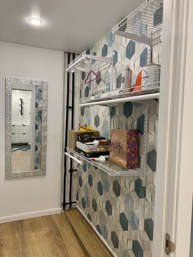
The storage chest is as ordinary as possible, suitable in size, and was purchased at an inexpensive offline store in Tula. I ordered fashionable black handles for it to replace the cheap plastic ones, and now it has a different look—it aspires to be a modest classic of minimalism.
Everything was going according to plan until I saw some blue hexagon-like 3D wallpaper and decided to use it for the dressing room. That was a mistake. They look good, of course, but they are narrow with frequent adjustments. Because of this, they turned out to be twice as expensive as plain ones would have been, and they have wardrobe systems on them. Plus, the pattern is too aggressive for a small room. I would not make the same choice again.

About windows and balconies
The old wooden windows have been replaced with Veka plastic ones, and the balcony has been renovated, clad, and glazed. 100,000 rubles turnkey — a local company. For some reason, all the surveyors tried to dissuade me from installing double glazing, but I was adamant. It's charming. And I will repeat myself once again, the shadows from this layout are my little joy. As well as the floor-to-ceiling balcony door.

About the bathroom finish
The decision on what the bathroom would look like was the easiest — modern and versatile. For such a small area, I decided not to go overboard: no decor, ornamentation, or lots of details. I wanted to create an ergonomic, comfortable bathroom. This design does not claim to be unique, but matte porcelain stoneware is convenient in terms of care and maintenance.

The only striking elements are the black matte faucets from Gappo, which are concise and geometric, like the rest of the bathroom decor. The bathtub (1Marka), sink + cabinet (Alavann), and wall-mounted toilet (Santek, Grohe installation) were also selected from among high-quality brands in the mid-price range for their geometric but not sharp shapes and optimal sizes.
It was difficult to find a cabinet at an acceptable price (13,000 rubles with delivery — excellent!) — the maximum allowable width is 50 cm. I am very happy with it. The faucets also turned out to be convenient and not so finicky to care for. The main thing is not to use harsh abrasive cleaners; sometimes it is enough to wipe them with a damp cloth. I bought a chrome rectangular towel warmer, as the black ones are too expensive.
About the hallway
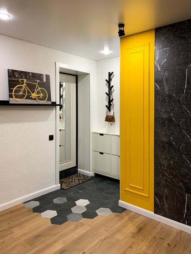
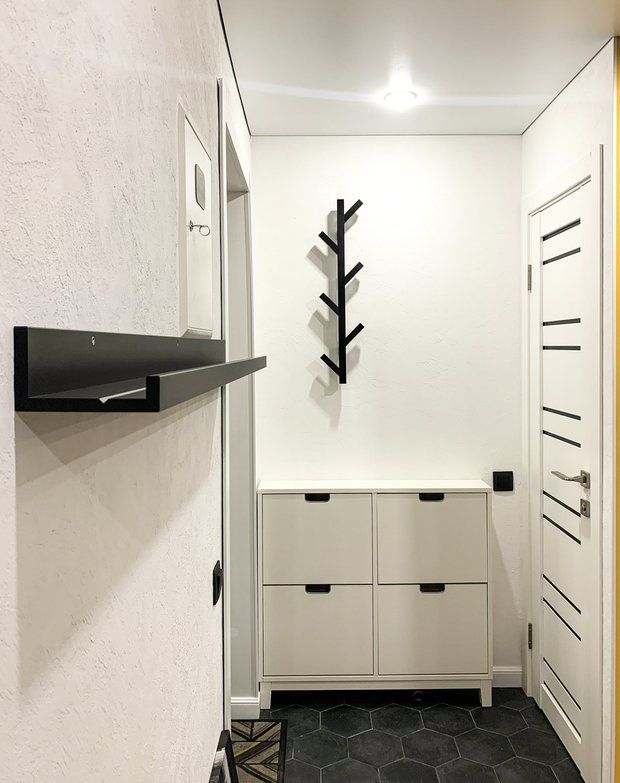
The hallway was the last thing to be furnished, as it is very small. The shoe rack from IKEA miraculously fit between the front door and the bathroom door. It fits perfectly there and does not interfere with opening the door.
The electrical panel was replaced and installed in the place of the old one, but the door and the beacon, of course, spoiled the view from the living room. I came up with a solution: a shelf for paintings from IKEA and a painting on canvas with a bicycle covering the panel. It is convenient to put keys/phone on the shelf at the entrance — a useful solution.
Important advice on saving money
Regarding savings on finishing materials: yes, I really believe that you can find good finishing materials in construction supermarkets, and I understand that the cost of repairs should be a reasonable proportion of the cost of the property you are investing in. But when it came to utilities—wiring, water supply—I didn't skimp and checked all the materials that the workers purchased and the routes they laid. For me, it's a nightmare to have to redo repairs because of poor engineering. This is really important!
This story clearly shows that even the most ordinary and cramped Khrushchev-era apartment can become a modern, bright, and very cozy home. The key to success is not a huge budget, but competent planning and bold design decisions.
The main lesson of this transformation is the importance of zoning. Combining the kitchen with the living room, a well-thought-out storage system, and the correct placement of furniture work wonders. The space has not only visually increased, but it has also become functional for living.
The “before” and “after” photos speak for themselves. A dark apartment with separate rooms has been transformed into a stylish and cohesive two-room apartment with space for everything: work, relaxation, entertaining guests, and privacy. This is an inspiring example of how you can radically improve your quality of life without changing your address.
If your apartment seems small and uncomfortable, don't despair. Perhaps, like this Khrushchev-era apartment, it just needs a fresh look and a competent approach to redevelopment. The dream of comfortable housing is often closer than it seems.


